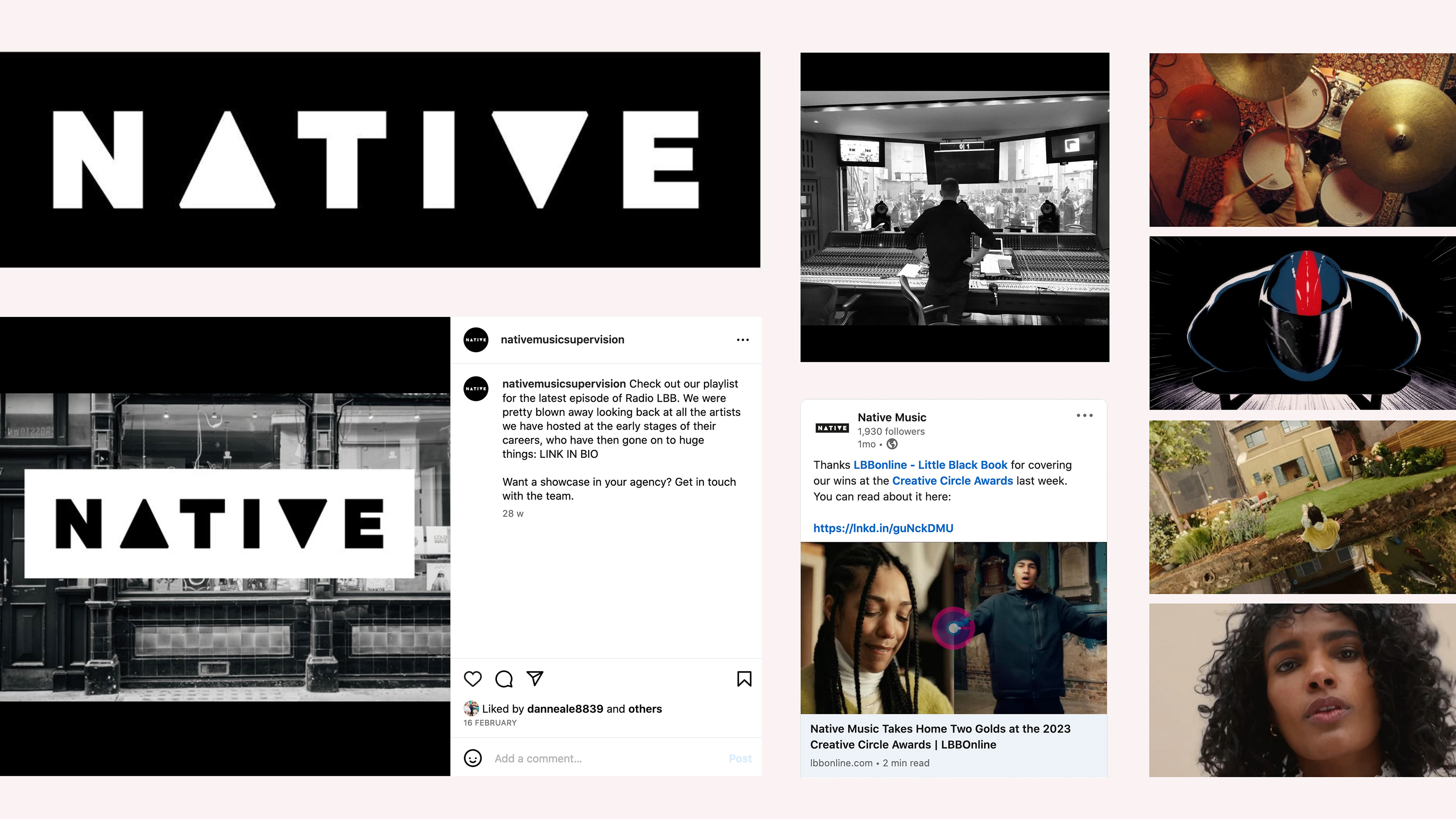
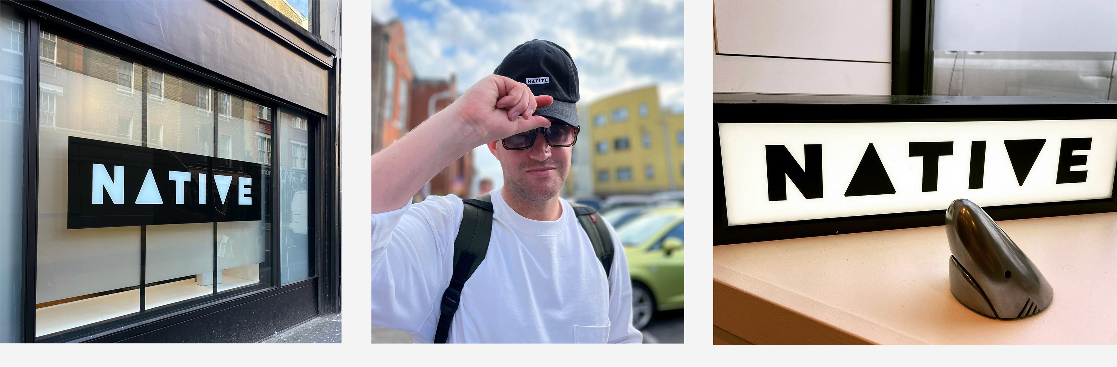
This London-based supervision and composition company sought a rebrand that was both simple and attention-grabbing, aiming to distinguish themselves from competitors in the same industry. I developed a design concept that focused on creating a strong visual identity while maintaining clarity and impact. The logo design made use of positive and negative space, cleverly incorporating a play button icon integrated into the 'a' and 'v' to represent the audio-visual aspect of the brand.
The black and white color scheme was chosen for its boldness and timeless appeal, creating a striking visual presence that would stand out across various applications.
In addition to the logo, I oversaw the campaign implementation, ensuring the rebrand was consistently applied across all touchpoints, from digital platforms to print materials. The result was a fresh, modern identity that elevated the brand and effectively communicated its unique position in the market.
Branding. Design concept. Logo and logotype design. Campaign implementation.


Ident motion by Fred Ashworth.