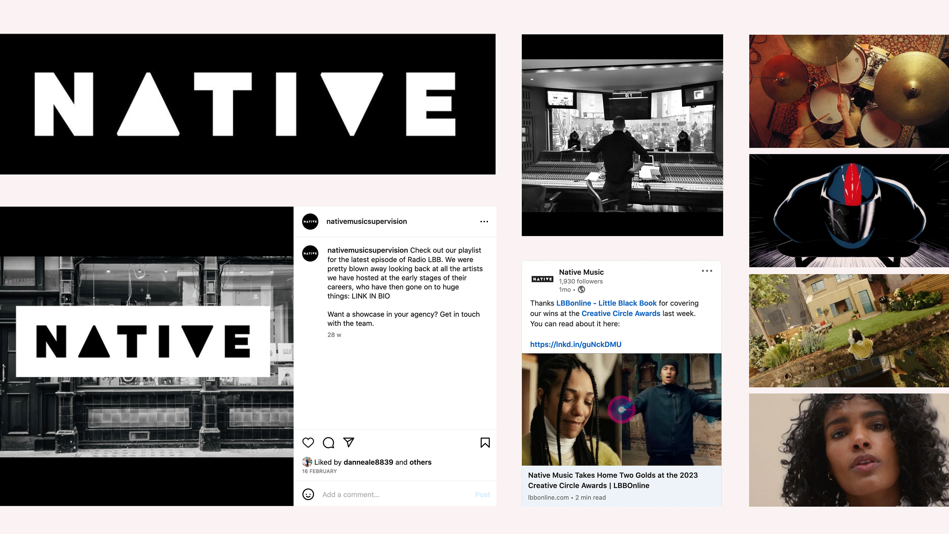
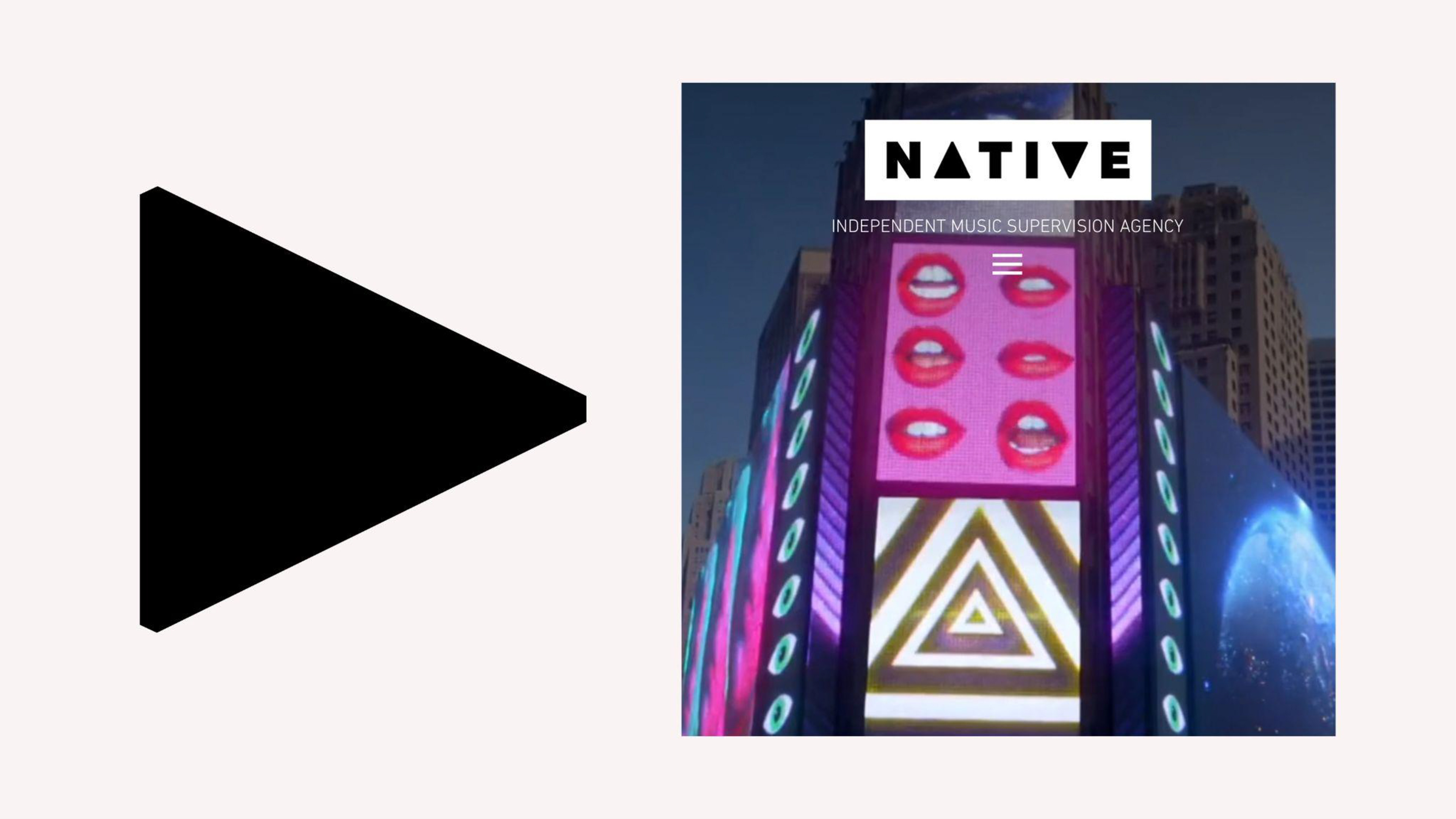
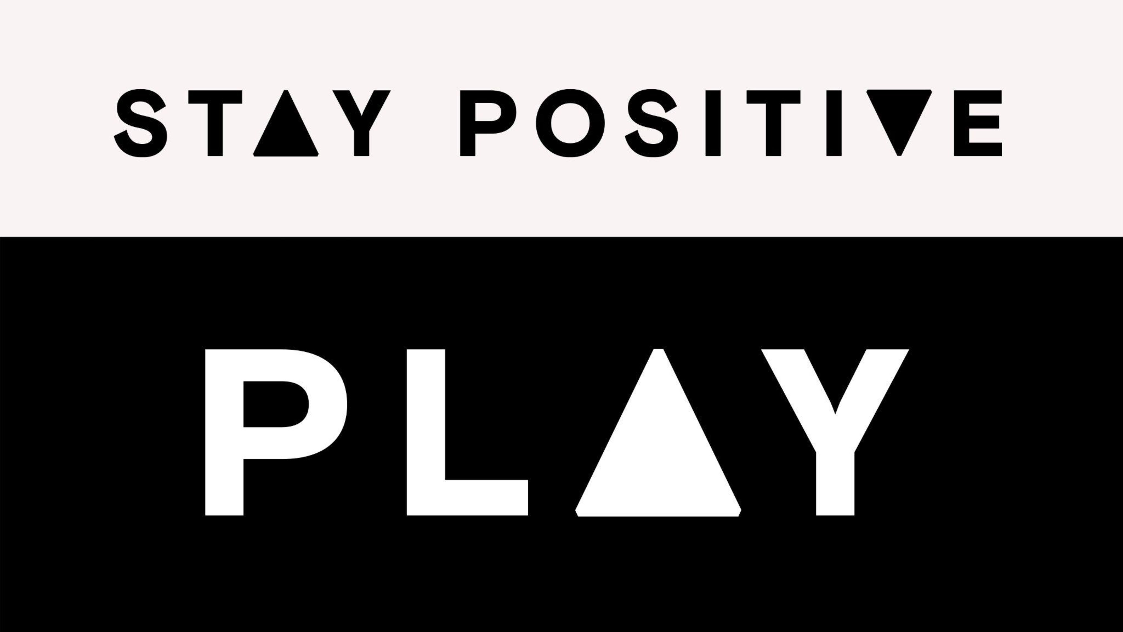
This London-based supervision and composition company sought a rebrand that was both simple and attention-grabbing, distinguishing them from their counterparts in the same industry. I developed a logo using positive and negative space, incorporating a play button icon, integrated into the 'a' and 'v' (representing audio-visual). The black and white execution achieved a striking impact.
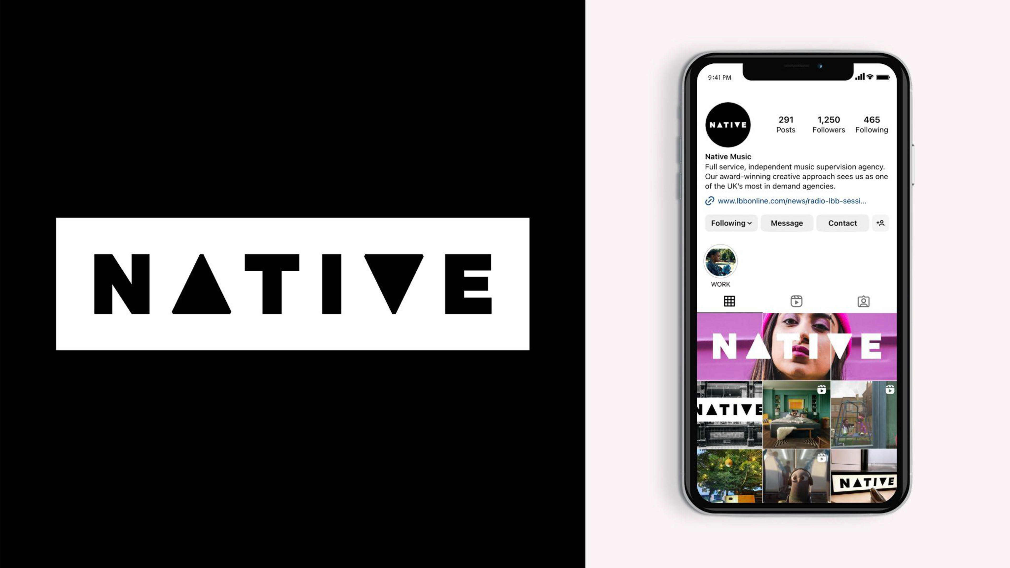
Design concept. Logo and logotype design. Campaign implementation.
↓
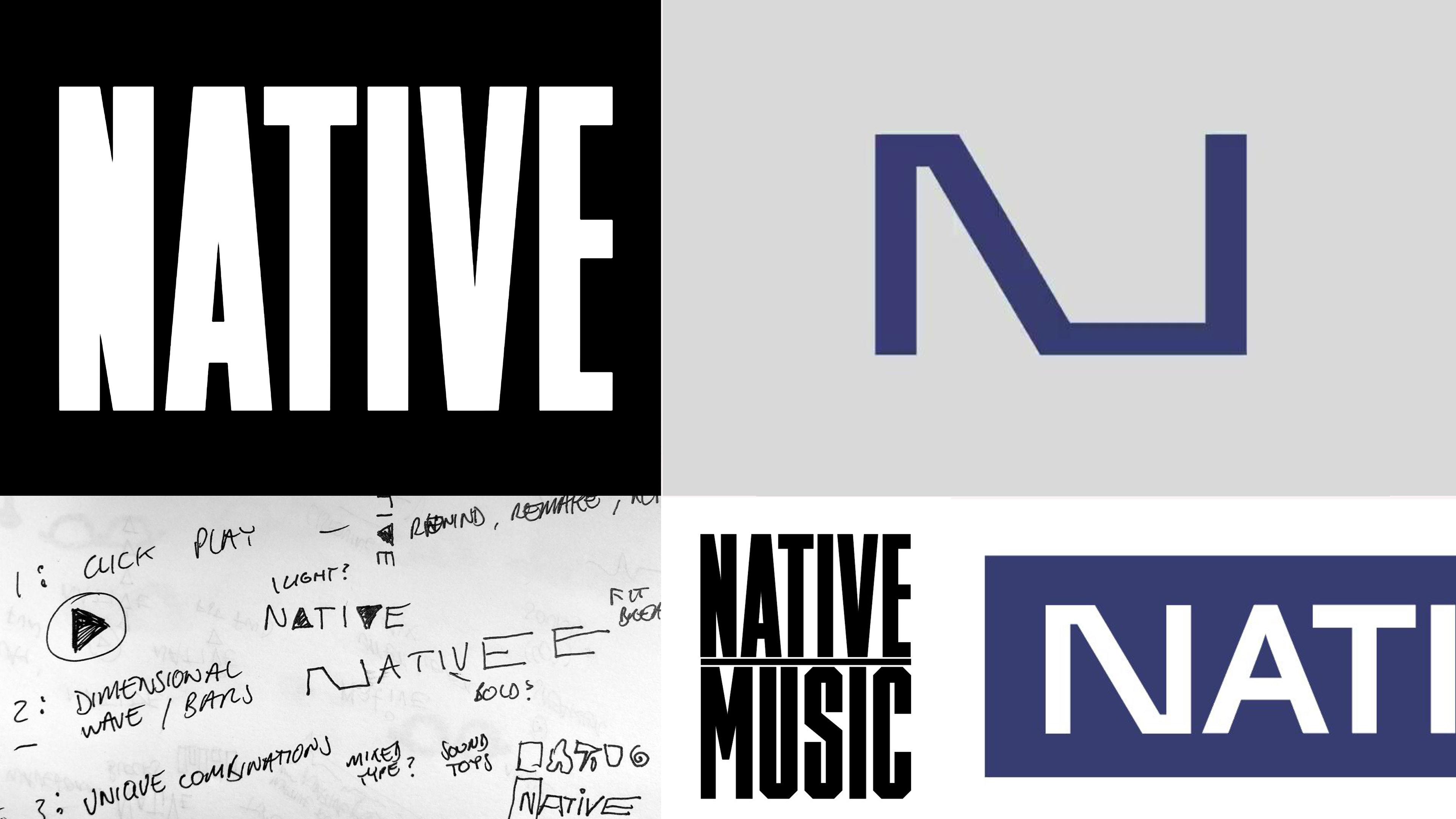
↓ Initial concepts and other routes from the presentation stages.